14pt vs 16pt Cardstock for Postcards: Which Thickness Should You Choose?
TLDR
Both 14pt and 16pt cardstock work well for postcards. Choose 14pt when you want a sturdy, practical piece for larger mailings. Choose 16pt when you want a slightly heavier feel or the postcard will be handled more before it reaches the recipient. Design, coating, mailing method, and print quality usually matter more than adding a small amount of thickness.
A postcard only has a few seconds to make an impression.
It comes out of the mailbox, gets flipped over, and either earns a closer look or heads toward the recycling bin. That makes the choice between 14pt vs 16pt cardstock for postcards worth thinking about, but probably not for the reason people expect.
Sixteen-point stock is thicker. That does not automatically make it the right choice.
The better stock depends on the job.
What Does 14pt Cardstock Mean?
The “pt” measurement describes the approximate thickness of the stock in thousandths of an inch.
So 14pt cardstock is roughly 0.014 inch thick, while 16pt stock is approximately 0.016 inch.
That sounds like a tiny difference.
It is.
But you can usually feel it when comparing the cards side by side. Sixteen-point cardstock feels a little more rigid and substantial.
Fourteen-point cardstock is still a standard, sturdy choice for postcards, business cards, appointment cards, and other marketing pieces.
When 14pt Cardstock Makes Sense
Fourteen-point stock is a good default for many direct-mail postcard projects.
It works especially well when:
- You are mailing a larger quantity.
- The postcard is primarily promotional.
- Cost per piece matters.
- The card does not need to feel unusually heavy.
- You plan to send campaigns repeatedly.
Imagine a local HVAC company mailing 10,000 seasonal maintenance postcards.
The customer is unlikely to decide whether to schedule service because the postcard is two thousandths of an inch thicker.
The offer, design, headline, timing, and call to action matter far more.
This is where 14pt cardstock is practical.
When 16pt Cardstock Is Worth Considering
Sixteen-point cardstock makes more sense when the physical feel of the card is part of the presentation.
Consider it for:
- Invitations
- High-value offers
- Luxury property postcards
- Photography promotions
- Premium appointment cards
- Small mailings where unit cost matters less
- Pieces customers may keep
The extra thickness can make a card feel a little more substantial in the hand.
It can also help a postcard resist bending during normal handling, although no cardstock is immune to damage in the mail.
Matte or Gloss Can Change the Feel Too
Thickness is only one variable.
A 14pt card with one finish can feel quite different from another 14pt card with a different coating.
Gloss tends to increase shine and can help colorful photography stand out.
Matte or satin finishes reduce glare and often create a softer appearance.
Uncoated stock has a more natural paper feel and can be easier to write on.
So before automatically moving from 14pt to 16pt, ask whether changing the finish would have a bigger effect on the final piece.
Sometimes it does.
Think About What Goes on the Postcard
The content should help determine the stock.
A postcard built around a large photograph may benefit from a coated surface.
A reminder card where staff members write appointment information may need a writable area.
A coupon customers are expected to keep in a wallet or on a refrigerator may benefit from heavier stock.
And if the postcard is part of a larger promotional package, you can connect the printed piece to other physical marketing.
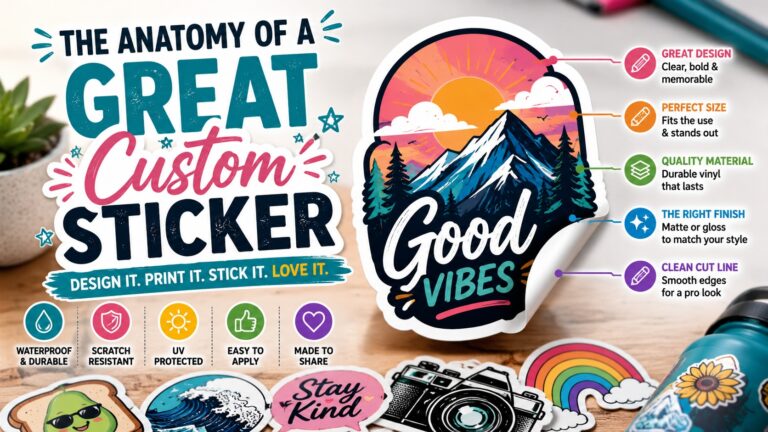
For example, a mailer might include a coupon while an in-store campaign uses durable custom vinyl stickers with the same artwork.
Consistency between pieces usually contributes more to the campaign than choosing cardstock based solely on which number is larger.
Don’t Make the Card Too Busy
Stock quality cannot rescue weak design.
A postcard normally needs:
- One clear headline
- One primary visual
- A short explanation
- A clear offer or reason to respond
- Contact information
- A direct next step
Trying to fit a full brochure onto a postcard makes the card harder to use.
If additional information matters, send the reader to a landing page or use a QR code.
Just keep the QR code large enough to scan comfortably after printing.
Test the Actual Piece
If you are deciding between 14pt vs 16pt cardstock for postcards and the choice matters to you, get samples.
Hold both.
Put them with your actual packaging or other printed material.
Show them to somebody who was not involved in the design.
The difference may seem important.
Or you may decide it is barely noticeable for your particular project.
That is useful information either way.
Spend the Budget Where Customers Notice It
Heavier stock can be worthwhile.
But it is one part of the finished postcard.
A clear message printed correctly on 14pt cardstock will usually outperform a confusing message printed on heavier paper simply because somebody assumed “thicker equals better.”
Choose 14pt for a sturdy everyday postcard.
Choose 16pt when the heavier feel supports the purpose of the piece.
Then put most of your attention into the part the customer actually reads.