The Anatomy of a Great Custom Sticker
TLDR
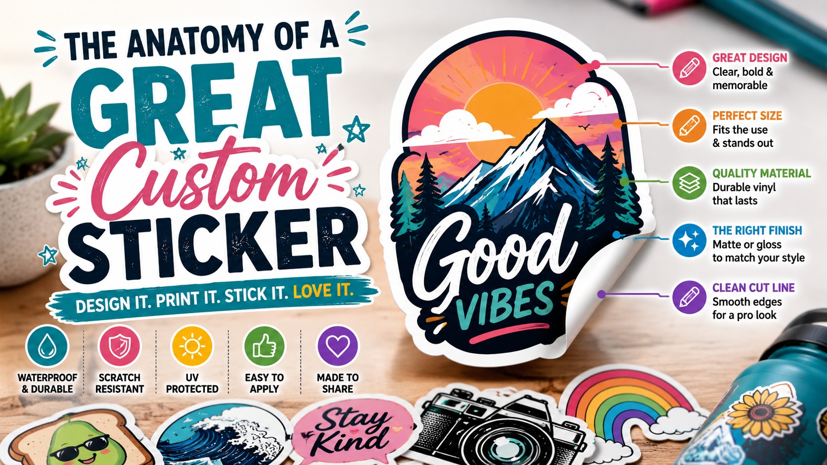
A great custom sticker has clear artwork, the right material, a practical size, a clean cut line, and a finish that matches how the sticker will be used.
For most everyday stickers, durable vinyl with a matte or gloss laminate is the safest choice. It gives the sticker a clean look and helps protect the print from water, scratches, and normal handling.
The best designs are simple, readable, and easy to understand at the final printed size.
Introduction
A good sticker looks nice. A great custom sticker does more than that.
It feels intentional. The shape fits the artwork. The colors are clear. The edges are clean. The material makes sense for where the sticker will go. And when someone peels it up and places it on a laptop, water bottle, notebook, package, cooler, or car window, it feels like the design was made for that moment.
That is the real anatomy of a great custom sticker. It is not just the drawing, logo, or slogan. It is the full set of choices around the design: size, shape, material, finish, adhesive, artwork quality, and final use.
This matters because stickers are small. A tiny mistake can become very obvious once the sticker is printed. A font that looked readable on a big screen may disappear at 2 inches wide. A thin border may look uneven after cutting. A paper material may look fine indoors but fall apart on a water bottle. None of these issues are dramatic, but they can make a sticker feel less polished.
The good news is that most sticker mistakes are easy to avoid. You just need to know what each part of the sticker is supposed to do.
If you are ordering stickers for merch, packaging, giveaways, events, or brand promotion, you can start with custom stickers and use the guide below to make better design choices before uploading your artwork.
Start With the Purpose of the Sticker
Before you choose a size or finish, answer one simple question: what is this sticker supposed to do?
A sticker for a water bottle has a different job than a sticker for a candle jar. A packaging sticker has a different job than a sticker someone buys as merch. A bumper sticker has a different job than a tiny logo sticker included inside an online order.
The purpose affects almost every decision.
For example:
- A laptop sticker should look good up close and hold up to handling.
- A water bottle sticker should resist moisture and scratches.
- A packaging sticker should make the product feel more finished.
- A logo sticker should be readable fast.
- A giveaway sticker should be bold enough that people actually want to use it.
- A product label should communicate clearly and apply cleanly in batches.
This is why there is no single “best” sticker for every project. There is only the best sticker for the job.
For most general custom stickers, individual vinyl stickers are the right fit. For product packaging, especially bottles, jars, boxes, and retail goods, custom labels may be the better option because labels are built for repeated application and a cleaner packaging workflow.
The Artwork: Clear, Simple, and Built for Print
The artwork is the heart of the sticker. But print artwork needs to be treated differently from artwork made only for a screen.
On a screen, you can zoom in. In real life, the sticker has a fixed size. A design that looks sharp at 12 inches wide on your monitor may become crowded and hard to read at 2.5 inches wide.
A strong sticker design usually has:
- One clear focal point
- Strong contrast
- Readable text
- Clean shapes
- Practical line thickness
- Enough space around important details
The best test is simple: shrink the design down to the final sticker size and look at it from arm’s length. If the main idea is still clear, you are probably in good shape. If you have to squint, the design needs to be simplified.
This is especially important for brand stickers. A logo sticker does not need to explain everything about the business. It needs to make the brand easy to recognize.
The Size: Big Enough to Read, Small Enough to Use
Sticker size affects how the design feels and where people can use it.
A 2-inch sticker is good for small logos, icons, simple art, and packaging extras. A 3-inch sticker is one of the safest all-purpose sizes because it works well for laptops, water bottles, notebooks, envelopes, and merch. A 4-inch sticker gives more room for artwork and text, but it may be too large for smaller surfaces.
Here is a practical way to think about sticker sizing:
| Sticker Size | Best For |
|---|---|
| 1 to 2 inches | Small logo stickers, product seals, icons, packaging accents |
| 2 to 3 inches | Water bottles, laptops, giveaways, brand stickers |
| 3 to 4 inches | Larger art stickers, merch, outdoor designs, bold logos |
| 4 inches and up | Statement stickers, coolers, vehicles, large packaging, signs |
Bigger is not always better. A large sticker can be harder to place and may not fit the surfaces your customers actually use.
Small stickers have their own problem: detail. If you choose a small size, keep the design simple. Thin text, small faces, complex illustrations, and narrow borders can get lost.
The Shape: Let the Cut Line Support the Design
The cut line is the path where the sticker is cut. It may seem like a production detail, but it has a big effect on how the finished sticker looks.
A great cut line feels natural. It follows the design without making the sticker fragile or awkward to apply.
Common sticker shapes include:
- Die cut stickers
- Circle stickers
- Square stickers
- Rectangle stickers
- Oval stickers
- Kiss cut stickers
- Sticker sheets
Die cut stickers are popular because the shape follows the artwork. This can make a logo, mascot, illustration, or slogan feel more custom.
But die cut does not mean the cut should follow every tiny detail. Too many sharp points, deep cuts, thin extensions, or delicate edges can make the sticker harder to peel and easier to damage.
A clean outline is usually better. Rounded corners and smooth curves tend to hold up well, especially for stickers that will go on bottles, laptops, helmets, coolers, or outdoor gear.
If your design has lots of tiny edges, consider adding a white border. That border gives the artwork breathing room and helps create a more practical cut shape.
The Border: Small Detail, Big Difference
A border can make a sticker look finished. It also helps separate the artwork from the surface underneath.
White borders are especially common on custom vinyl stickers because they add contrast. A white outline around a colorful design can help the sticker stand out on dark laptops, bottles, packaging, or car windows.
But borders need to be thick enough to print and cut cleanly. A very thin border can look uneven if the cut shifts slightly during production. This is normal in printing and cutting, not a sign that something went wrong.
For many designs, a slightly thicker border looks more intentional and holds up better visually.
Use a border when:
- The artwork has an irregular shape
- The design needs contrast
- The sticker will go on many different surface colors
- The edge of the artwork is detailed
- You want a classic die cut sticker look
Skip the border when:
- You want a full-bleed background
- The sticker is a simple circle, square, or rectangle
- The design already has a strong outer shape
- You want a cleaner label-style look
Neither choice is automatically better. The right choice depends on the artwork.
The Material: Match the Sticker to Its Environment
Material is where a lot of sticker orders succeed or fail.
Paper stickers can work well for indoor uses, temporary labels, stationery, packaging, and low-contact projects. But they are usually not the best choice for water bottles, outdoor gear, vehicles, laptops, or anything that gets handled often.
Vinyl is the stronger everyday choice for custom stickers. It is more durable, more flexible, and better suited for moisture and regular handling.
For most sticker projects, laminated vinyl is the safest option because it gives you a cleaner finished look and better protection than a basic unlaminated sticker. YouStickers custom stickers are printed on durable vinyl and finished with either matte or gloss laminate, which makes them a strong fit for common uses like laptops, packaging, water bottles, merch, and personal projects.
Choose vinyl stickers for:
- Water bottles
- Laptops
- Coolers
- Cars
- Outdoor gear
- Brand giveaways
- Artist merch
- Sticker packs
- Packaging inserts
Choose labels for:
- Bottles
- Jars
- Boxes
- Product packaging
- Retail goods
- Repeated application
- Batch labeling
This distinction helps. Stickers are usually built for individual use. Labels are usually built for packaging.
The Finish: Matte, Gloss, Clear, or Specialty
The finish changes the look and feel of the sticker. It also affects readability.
Matte Finish
Matte stickers have a softer, lower-glare look. They feel clean, modern, and a little more understated.
Matte works well for:
- Minimalist designs
- Text-heavy stickers
- Boutique branding
- Wellness brands
- Outdoor brands
- Soft color palettes
- Packaging inserts
Matte is also helpful when glare could make text harder to read.
Gloss Finish
Gloss stickers are shinier. They can make colors look brighter and more saturated.
Gloss works well for:
- Bold artwork
- Colorful designs
- Mascots
- Sports stickers
- Kids’ stickers
- Event stickers
- High-contrast logos
The tradeoff is glare. On curved or shiny surfaces, gloss can reflect light. That is not always a problem, but it matters if your sticker has small text.
Clear Stickers
Clear stickers let the surface show through. They can look clean on glass, plastic, and light-colored surfaces.
Clear works best for:
- Simple logos
- Window-style designs
- Minimal branding
- Light-colored products
- Smooth packaging
Clear is less forgiving on dark surfaces. If the design does not have enough contrast, it may disappear.
Holographic Stickers
Holographic stickers add a rainbow effect. They work best when the effect supports the artwork.
Use holographic material for bold shapes, simple designs, limited-edition merch, or designs meant to catch light. Avoid it for tiny text or very detailed artwork unless you are sure the design will still be readable.
The Adhesive: Think About Where the Sticker Will Go
Adhesive is easy to ignore because you cannot see it. But it affects the real experience.
A good sticker should stick cleanly to the intended surface. Smooth surfaces usually work best. Rough, dusty, oily, curved, or textured surfaces can make adhesion harder.
Common good surfaces include:
- Laptops
- Smooth water bottles
- Glass
- Plastic
- Painted metal
- Notebooks
- Shipping boxes
- Retail packaging
More difficult surfaces include:
- Fabric
- Rubber
- Heavily textured plastic
- Powder-coated surfaces
- Dirty or oily surfaces
- Wet surfaces
- Very tight curves
Application matters too. Even a well-made sticker can peel early if it is applied to a dusty, damp, or oily surface.
For best results, clean the surface, let it dry, apply slowly, and press firmly around the edges.
The Text: Say Less, Make It Readable
Text is one of the easiest parts of a sticker to overdo.
A sticker is not a brochure. It does not have much room. If the design has too many words, the whole thing can feel cramped.
For most custom sticker designs, keep the text short and make the most important words the largest.
Good sticker text includes:
- Brand names
- Short slogans
- City or location names
- Team names
- Event names
- Simple product names
Risky sticker text includes:
- Long quotes
- Dense paragraphs
- Tiny social handles
- Thin script fonts
- Multiple font styles
- Low-contrast lettering
A script font can look great, but it needs enough size and spacing. Thin lettering may look elegant on screen and weak in print.
Before ordering, view the sticker at actual size. That one step catches a lot of problems.
The Color: Contrast Beats Complexity
Color helps a sticker get noticed. But a great sticker does not need every color.
High contrast is more important than complexity. A simple two-color design can be stronger than a crowded full-color design if it reads clearly.
Think about where the sticker will be placed. A dark design may not stand out on a black laptop. A pale pastel design may disappear on a white water bottle. A transparent sticker may look great on glass but weak on a dark tumbler.
If your sticker will be used on many surfaces, build in contrast. A white border, bold outline, or solid background shape can help.
Also remember that screens and printed stickers are not the same. Screen brightness can make colors look more intense than they will look in print. A proof helps you review layout, shape, and setup before production, but it is still smart to design with practical contrast from the start.
The Proof: Your Last Chance to Catch Problems
The proof is one of the most important parts of the custom sticker process.
A proof lets you review the size, shape, cut line, artwork placement, and overall layout before production. This is where you catch issues like text too close to the edge, an awkward cut shape, unexpected borders, or sizing that does not match your goal.
Do not rush the proof. Look at it closely.
Check for:
- Correct size
- Correct shape
- Correct spelling
- Clean cut line
- Proper border thickness
- Important details inside the safe area
- Artwork centered the way you want
- Finish and material selected correctly
This step is especially important for business stickers. A small typo on one personal sticker is annoying. A typo on 500 logo stickers is a much bigger problem.
A Simple Custom Sticker Checklist
Before you upload your artwork, run through this checklist:
- Is the purpose of the sticker clear?
- Is the artwork high resolution?
- Is the main idea readable at the final size?
- Is the text large enough?
- Is there enough contrast?
- Are important details away from the cut edge?
- Does the shape fit the artwork?
- Is the border thick enough, if using one?
- Is the material right for the surface?
- Is the finish right for the design?
- Have you checked the proof carefully?
That may sound like a lot, but it becomes quick once you know what to look for.
What Makes a Custom Sticker Feel Professional?
A professional sticker feels resolved. Nothing looks accidental.
The cut line supports the artwork. The size fits the use. The finish matches the style. The text is readable. The colors have enough contrast. The material makes sense for where the sticker will be placed.
That is the difference between a sticker that only looks good in a mockup and a sticker people actually want to use.
A great custom sticker does not need to be complicated. In many cases, the best stickers are the simplest ones: one strong idea, printed cleanly, cut well, and made from the right material.